This post was most recently updated on June 17th, 2019
What is contrast in Accessibility?
Contrast is a visual difference used for distinguishing a certain object (or objects). Contrast in Accessibility is about finding colors that not only provide maximum contrast, but provide enough contrast between content and the background so that it can be read by people with moderately low or no vision.
Contrast in Accessibility is an important aspect of color on the Web for both low vision and colorblind users, where website has sufficient contrast between text color and its background (technically called luminosity contrast ratio) this includes text on images, icons, and buttons. And also where colors used to convey information on diagrams, maps, and other types of images must be distinguishable.
Why it is important to achieve contrast?
As per W3C.org recommendation and standards, the contrast is calculated in such a way that color is not a key factor so that people who have a color vision deficit will also have adequate contrast between the text and the background.
For people with Low Vision its difficult to read designed text, light color text, text with light background color with near by foreground color. To display content clearly we must provide appropriate contrast to respected content.
How to calculate contrast ratio:
The contrast between all text and its background is at least 4.5:1 for normal-size text to achieve Level AA accessibility.
Contrast Ratio can be calculated by number of contrast tools in which some popular are listed below.
- Wave chrome extension: WAVE is a web accessibility evaluation tool developed by WebAIM.org. It provides visual feedback about the accessibility of your web content by injecting icons and indicators into your page.
There are three ways to check contrast, each with strengths and weaknesses.
- The tool displays a table with all the possible contrast ratios in the web page. With some tools, you can click in the table and it will show where that color combination is in the web page.
- Eye-dropper to select colors – The tool lets you select a text color and a background color, then it shows you the contrast ratio.
- Turn off color. The tool shows the page in gray scale.
- Contrast Ratio Checker chrome extension: Click on any part of the website to see what Web Content Accessibility Guidelines(WCAG) 2.0 level the ratio between the foreground text color and the background color is in conformity with.
I also prefer below tools to get contrast ratio:
Select text and background colors that provide sufficient contrast. There are tools to help check and select appropriate color combinations While some people need high contrast, some people are sensitive to brightness and need to change the colors. Content must be properly designed and coded so that it can adapt to different customization settings.
How to achieve different contrast level:
The latest accessibility guidelines (WCAG 2.0 1.4.3) require that text (and images of text) provide adequate contrast for people who have visual impairments. Contrast is measured using a formula that gives a ratio ranging from 1:1 (no contrast, e.g., black text on a black background) to 21:1 (maximum contrast, e.g., black text on a white background). Using this formula, the requirements are:
- Ratio (3:1) – minimum contrast for “large scale” text (18 pt or 14 pt bold, or larger) under WCAG 2.0 1.4.3 (Level AA).
- Ratio (4.5:1) – minimum contrast for regular sized text under WCAG 2.0 1.4.3 (Level AA).
- Ratio (7:1) – “enhanced” contrast for regular sized text under WCAG 2.0 1.4.6 (Level AAA).
Example:
Here to achieve different contrast ratio for different Contrast Level we have to lighter or darker the color of background as well as foreground content. here background & foreground are inversely proportional to each other.
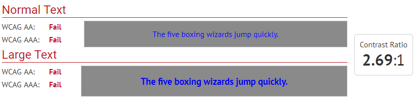
- Accessibility Contrast Example One
- Here i provide css as background-color: #8C8C8C, foreground-color: #0000FF. Which fails the WCAG standard for both normal as well as Large text for Level AA and AAA. Here as we see below the ratio between background and foreground color is 2.69:1.
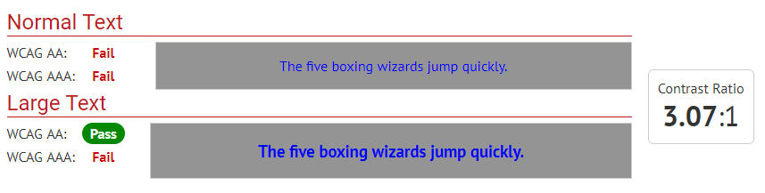
- Accessibility Contrast Example Two
- Here i change css background-color: #9C9C9C and foreground-color: #0000FF remains same. Which passes only the WCAG standard for Large text for Level AA. Here as we see below the ratio between background and foreground color is 3.07:1.
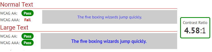
- Accessibility Contrast Example Three
- Here i change css background-color: #BFBFBF and foreground-color: #0000FF remains same. Which passes the WCAG standard for normal as well as Large text for Level AA and only on Large text for Level AAA . Here as we see below the ratio between background and foreground color is 4.58:1.
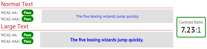
- Accessibility Contrast Example Four
- Here i change css background-color: #EBEBEB and foreground-color: #0000FF remains same. Which passes the WCAG standard All size Text for both Level AA and Level AAA. Here as we see below the ratio between background and foreground color is 7.23:1.
Different Contrast Mode present in Windows operating system:
- how to open setting for contrast. (Open “High Contrast Setting” in settings → Choose any theme form below) :
Theme 1: High Contrast #1 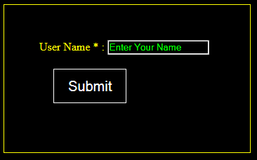
Theme 2: High Contrast #2. 
Theme 3: High Contrast Black. 
Theme 4: High Contrast White. 
.
- To provide Custom CSS for contrast in different themes use below @media query:
- @media screen and (-ms-high-contrast: active) {
/* All high contrast styling here*/
} - @media screen and (-ms-high-contrast: black-on-white) {
/*High contrast Black styling here*/
} - @media screen and (-ms-high-contrast: white-on-black) {
/*high contrast White styling here*/
}
- @media screen and (-ms-high-contrast: active) {
Steps To achieve contrast Level as a developer:
- Check contrast in every browser with normal browser mode.
- Need to check contrast on each Buttons, Heading, Links, border color and width, background color, font-color in normal mode as well as browser mode.
- Need to check contrast color of “on focus element” “on hover element”, “selected element” in each browser with normal browser mode as well as contrast mode.
- Verify that the type of element and content should have same and appropriate color combination in through out the site.
- Need to set form elements with contrast standard.
- If providing background image with css property then we have to provide new images for each contrast mode.
Different contrast level mentioned in W3C.org website:
Common Points To remember:
- Using a higher contrast value for text that is over a patterned background.
- Using Unicode text and style sheets instead of images of text.
- Using a higher contrast values for lines in diagrams.
- Using greater contrast level for red-black text/background combinations.
- Using colors that are composed predominantly of mid spectral components for the light and spectral extremes (blue and red wavelengths) for the dark.
- Using a light pastel background rather than a white background behind black text to create sufficient but not extreme contrast.
- Making icons using simple line drawings that meet the contrast provisions for text.
- Providing sufficient contrast ratio in graphs and charts.
- Using a minimum 3:1 contrast ratio or higher as the default presentation.
- Providing sufficient color contrast for empty text fields.
- G148: Not specifying background color, not specifying text color, and not using technology features that change those defaults.
- G174: Providing a control with a sufficient contrast ratio that allows users to switch to a presentation that uses sufficient contrast.
- SL13: Providing A Style Switcher To Switch To High Contrast.
Contrast Level AA:
- G18: Ensuring that a contrast ratio of at least 4.5:1 exists between text (and images of text) and background behind the text.
Contrast Level AAA:
- G17: Ensuring that a contrast ratio of at least 7:1 exists between text (and images of text) and background behind the text.