Parent flex container properties
1. display
{ display: flex | inline-flex }
“display” defines a flex container; when you specify “display” value to “flex” it consider as block container and if you specify “display” value to “inline-flex” it consider as inline-block container.
– See usage and the differences shown in the below examples.
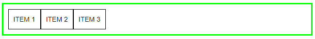
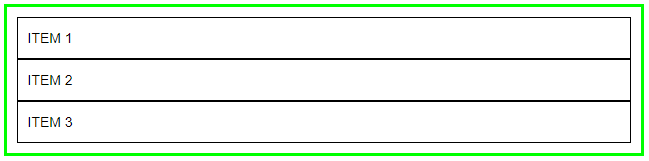
display: flex
CSS
|
1 2 3 |
.container { border:3px solid #00FF00; padding:10px; } .flex-item { border:1px solid #000000; padding:10px; } .flex-container { display: flex; } |
HTML
|
1 2 3 4 5 |
<div class="container flex-container"> <div class="flex-item"> ITEM 1 </div> <div class="flex-item"> ITEM 2 </div> <div class="flex-item"> ITEM 3 </div> </div> |
In this example Green Border container “display” property value is “flex”, it cover whole page width and its child items are with their auto width.
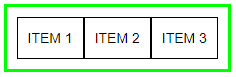
display: inline-flex
CSS
|
1 2 3 |
.container { border:3px solid #00FF00; padding:10px; } .flex-item { border:1px solid #000000; padding:10px; } .inline-flex-container { display: inline-flex; } |
HTML
|
1 2 3 4 5 |
<div class="container inline-flex-container"> <div class="flex-item"> ITEM 1 </div> <div class="flex-item"> ITEM 2 </div> <div class="flex-item"> ITEM 3 </div> </div> |
In this example Green Border container “display” property value is “inline-flex”, it covers only the width according to its all child items width.
2. flex-direction
{ flex-direction: row | row-reverse | column | column-reverse }
In this property you can set flex container child items direction in horizontal rows or vertical columns. Child items starts from left to right, right to left, top to bottom or bottom to top.
– See usage and the differences shown in the below examples.
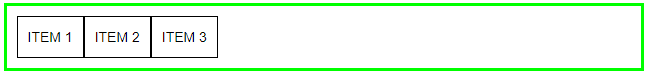
flex-direction: row
CSS
|
1 2 3 |
.container { border:3px solid #00FF00; padding:10px; } .flex-item { border:1px solid #000000; padding:10px; } .flex-direction-row { display: flex; flex-direction: row; } |
HTML
|
1 2 3 4 5 |
<div class="container flex-direction-row"> <div class="flex-item"> ITEM 1 </div> <div class="flex-item"> ITEM 2 </div> <div class="flex-item"> ITEM 3 </div> </div> |
Use the above “CSS” and “HTML” snippets to try yourself examples shown below and replace class name “flex-direction-row” besides of “container” class accordingly.
Items horizontally starts from left to right direction.
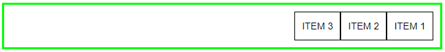
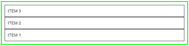
flex-direction: row-reverse
.flex-direction-row-reverse { display: flex; flex-direction: row-reverse; }
Items horizontally reverse, items starts from right to left direction.
flex-direction: column
.flex-direction-column { display: flex; flex-direction: column; }
Items vertically starts from top to bottom direction.
flex-direction: column-reverse
.flex-direction-column-reverse { display: flex; flex-direction: column-reverse; }
Items reverse vertically, starts from bottom to top direction.
3. flex-wrap
{ flex-wrap: nowrap | wrap | wrap-reverse }
By default, flex items fit onto one line. We can change flex items as per our requirement with “flex-wrap” property.
– See usage and the differences shown in the below examples.
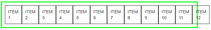
flex-wrap: nowrap
CSS
|
1 2 3 |
.container { border:3px solid #00FF00; padding:10px; } .flex-item { border:1px solid #000000; padding:10px; } .flex-nowrap { display:flex; flex-wrap: nowrap; } |
HTML
|
1 2 3 4 5 6 7 8 9 10 11 12 13 14 |
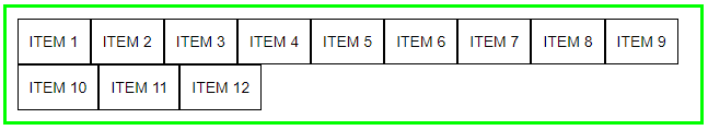
<div class="container flex-nowrap"> <div class="flex-item"> ITEM 1 </div> <div class="flex-item"> ITEM 2 </div> <div class="flex-item"> ITEM 3 </div> <div class="flex-item"> ITEM 4 </div> <div class="flex-item"> ITEM 5 </div> <div class="flex-item"> ITEM 6 </div> <div class="flex-item"> ITEM 7 </div> <div class="flex-item"> ITEM 8 </div> <div class="flex-item"> ITEM 9 </div> <div class="flex-item"> ITEM 10 </div> <div class="flex-item"> ITEM 11 </div> <div class="flex-item"> ITEM 12 </div> </div> |
Use the above “CSS” and “HTML” snippets to try yourself examples shown below and replace class name “flex-nowrap” besides of “container” class accordingly.
In this case all items will be display in one line it will never wrap to second line.
Items overlaps the flex container width if “flex-wrap: nowrap” property use with “display: flex”.
|
1 |
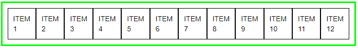
.flex-nowrap { display: inline-flex; flex-wrap: nowrap; } |
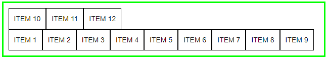
In this case all items will be display in one line it will never wrap onto multiple lines.
Items not overlaps the flex container width if “flex-wrap: nowrap” property use with “display: inline-flex”.
flex-wrap: wrap
|
1 |
.flex-wrap { display:flex | inline-flex; flex-wrap: wrap; } |
In this case items will wrap onto multiple lines.
flex-wrap: wrap-reverse
|
1 |
.flex-wrap-reverse { display: flex | inline-flex; flex-wrap: wrap-reverse; } |
In this case items wrap onto multiple lines but reverse to top line. “wrap-reverse” value reverse all items after crossed flex container width limit.
4. flex-flow
{ flex-flow: row nowrap | row wrap | row wrap-reverse | row-reverse nowrap | row-reverse wrap | row-reverse wrap-reverse | column nowrap | column wrap | column wrap-reverse | column-reverse nowrap | column-reverse wrap | column-reverse wrap-reverse }
The flex-flow property is sub-property of flex layout. It is shorthand for flex-direction and flex-wrap properties. Both properties values we can use together in single “flex-flow” property.
– See usage shown in the below snippets.
|
1 2 3 4 5 |
.flex-flow { display:flex; flex-flow: row nowrap; } or .flex-flow { display:flex; flex-flow: row wrap; } or .flex-flow { display:flex; flex-flow: row wrap-reverse; } |
See all the above examples in the demo page here or click on demo images shown in the examples.
Click here more details about “How to use flex properties? – Part 2” article