This post was most recently updated on August 2nd, 2024
The word “composed” mean to combine/putting together different elements to make something new or different for consistent look and feel. SharePoint composed look feature available in SharePoint 2013 and SharePoint 2013 online, associated with look and feel of SharePoint site.
A Composed Look is made up of following elements:
- Master Pages
- Color palettes
- Font palettes
- Background image
The following table lists the elements of a composed look.
|
Element |
File or files |
Where it’s stored |
Required? |
|
Color palette |
.spcolor |
Theme Gallery\15 folder |
Yes |
|
Font scheme |
.spfont |
Theme Gallery\15 folder |
No |
|
Site layout |
.master .preview |
Master Page Gallery (_catalogs) |
Yes |
|
Background image |
.jpg .bmp .png .gif |
Site assets |
No |
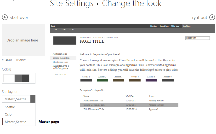
How to change SharePoint look and feel using composed look predefined interfaces?
- Navigate to Site Setting under Look and feel section
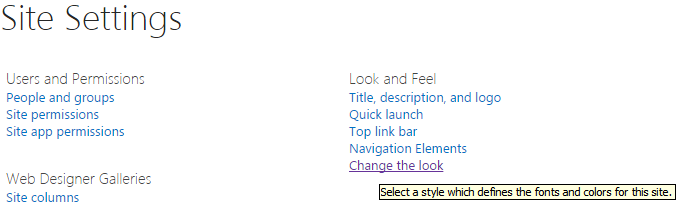
- Click on Change the Look link.
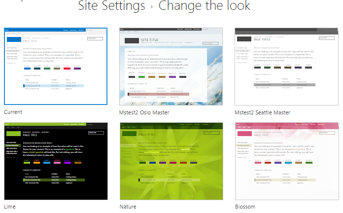
- Select one of the interface here I select current interface.
Composed look is whole packaged of above elements if there is requirement to create custom composed look to branding our SharePoint site we need to create above four elements where background image, fonts and color are optional elements.
How to create new custom composed looks?
To create new custom composed looks we need to create above four elements.
- Create custom master page.
- Open SharePoint designer and navigate to _catalogs folder. Under _catalogs go to masterpage folder where all master page are kept.
- Copy default master page and rename to it. Here I give mstest_seattle.master
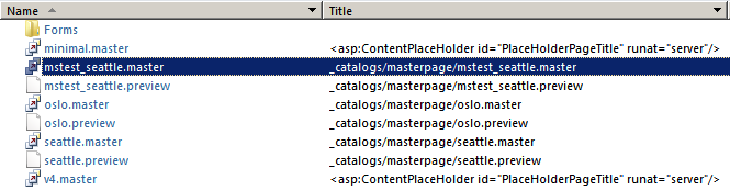
The .Preview file should have the same name as the HTML and Master file, it is used to make master page you create available in the drop down menu of “Site Layout” when modifying a composed look otherwise it not show in drop down.
- Color palettes
Color palettes is .spcolor file which composed of different color to each and every elements of master page. This file kept in theme folder under _catalogs folder. _catalogs/theme/15/list of spcolor file.
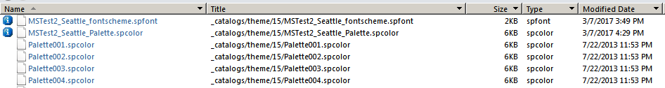
Copy paste one of the Palette spcolor files and rename it. The files will be displayed alphabetically in SharePoint. Here I copy palette001.spcolor file and rename to MSTest_Seattle_Palette.spcolor and check in.
How to modify spcolor file?
Basically spcolor file is xml file so we modify in two ways first way is by designer and second easy way is by SharePoint color palette tool.
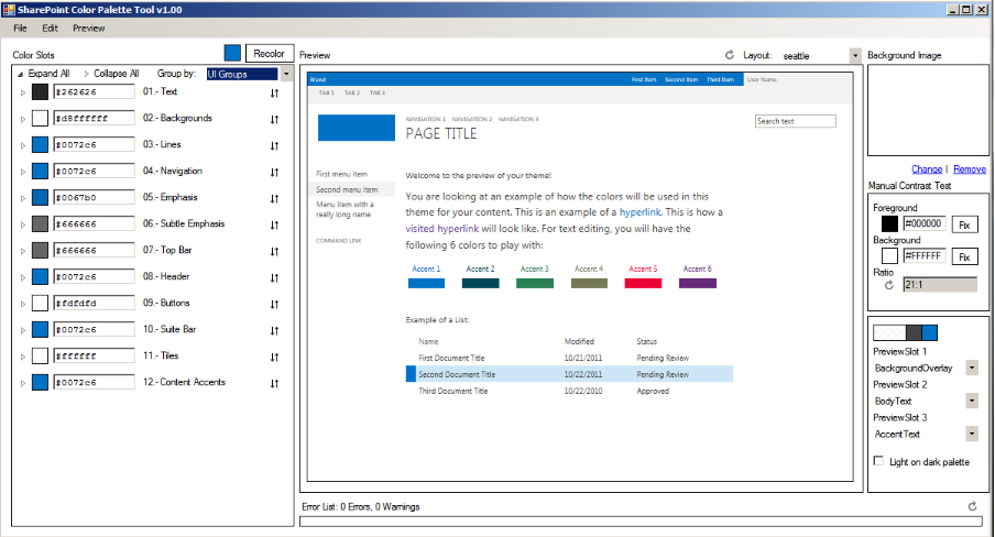
- Open spcolor file in SharePoint color palette tool.
- Select layout either a Seattle or Oslo and select group by UI groups
- There are 12 groups are they Text, Background, Buttons, Navigation etc. mention color code in hexadecimal in textbox and see preview how page looks like.
- Save spcolor file and upload it in _catalogs/theme/15/
Because my file name starts with M and all others with a P, my color file will be displayed first in the Color menu of my Composed Look.
- Font palettes
In the same way that color palettes, we also define font schemes fonts to composed looks.
Font schemes are defined in the .spfont file stored in the Theme Gallery. The .spfont file includes the following font slots that define the name, typeface, and script values of a composed look:
- Title
- Navigation
- Small-heading
- heading
- Large-heading
- Body
- Large body
How to create spfont file?
- Copy paste one of the font scheme spfont files and rename it. The files will be displayed alphabetically in SharePoint.
- Here I copy palette001.spfont file and rename MSTest_Seattle_fontscheme delete all code and paste below code.
Here I Mention font scheme name Roboto see below
<?xml version=”1.0″ encoding=”utf-8″?>
<s:fontScheme name=”Roboto” previewSlot1=”title” previewSlot2=”body”
xmlns:s=”http://schemas.microsoft.com/sharepoint/”>
<s:fontSlots>
<s:fontSlot name=”title”>
<s:latin typeface=”Roboto Black” />
<s:ea typeface=”” />
<s:cs typeface=”Roboto Black” />
</s:fontSlot>
<s:fontSlot name=”navigation”>
<s:latin typeface=”Roboto Black” />
<s:ea typeface=”” />
<s:cs typeface=”Roboto Black” />
</s:fontSlot>
<s:fontSlot name=”small-heading”>
<s:latin typeface=”Roboto Black” />
<s:ea typeface=”” />
<s:cs typeface=”Roboto Black” />
</s:fontSlot>
<s:fontSlot name=”heading”>
<s:latin typeface=”Roboto Black” />
<s:ea typeface=”” />
<s:cs typeface=”Roboto Black” />
</s:fontSlot>
<s:fontSlot name=”large-heading”>
<s:latin typeface=”Roboto Black” />
<s:ea typeface=”” />
<s:cs typeface=”Roboto Black” />
</s:fontSlot>
<s:fontSlot name=”body”>
<s:latin typeface=”Roboto Black” />
<s:ea typeface=”” />
<s:cs typeface=”Roboto Black” />
</s:fontSlot>
<s:fontSlot name=”large-body”>
<s:latin typeface=”Roboto Black” />
<s:ea typeface=”” />
<s:cs typeface=”Roboto Black” />
</s:fontSlot>
</s:fontSlots>
</s:fontScheme>
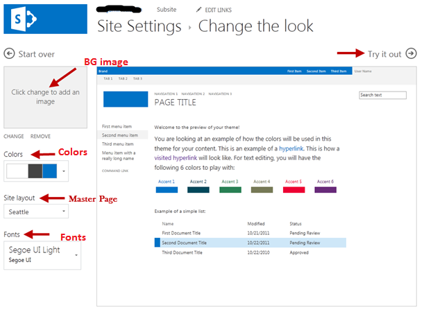
- Background Image
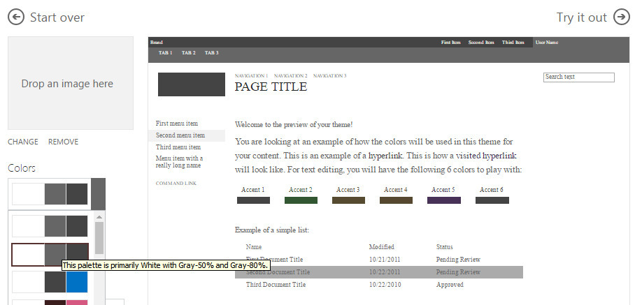
You can change the background image of a composed look by choosing Change option in look and feel.
After completing all above elements next step is to create entry of over custom composed look.
- Navigate to site setting page under Web Designer galleries section click on composed look option.
- This list consist list of predefined composed look names are orange, green, gray etc.
- For our custom composed look click on new item button.
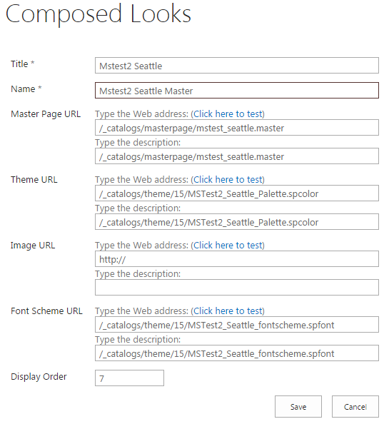
Fill the details like Title, Name, Master Page Url, Image Url etc.
- Click on save button.
How apply custom theme to our site?
- Navigate to site setting page under Look and feel section click on change the look option.
- Select our custom look and click on try it out.
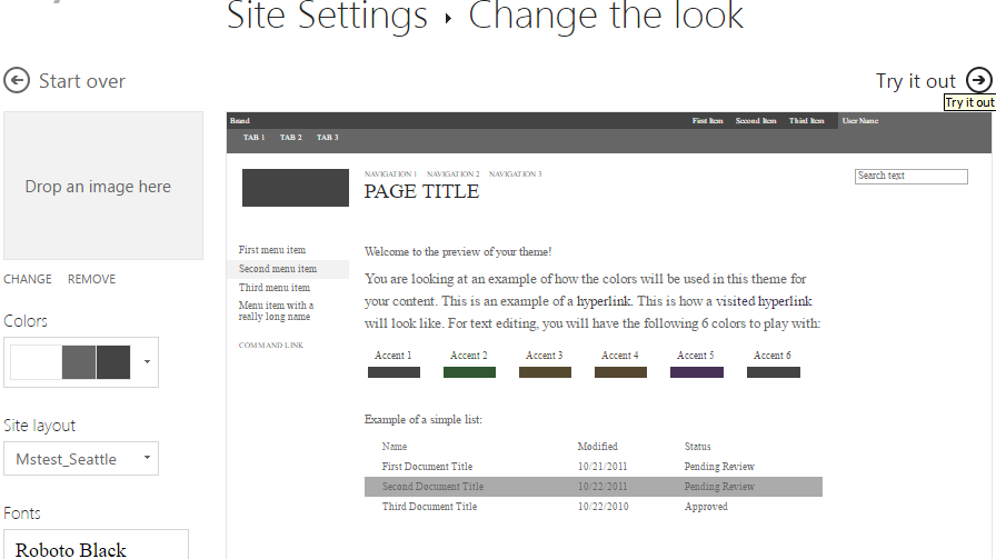
Then it take some time for theame apply and see preview of site if everything is ok then click on Yes keep it button located on right upper corner of preview site.
For more info about colot slot and fonts click here